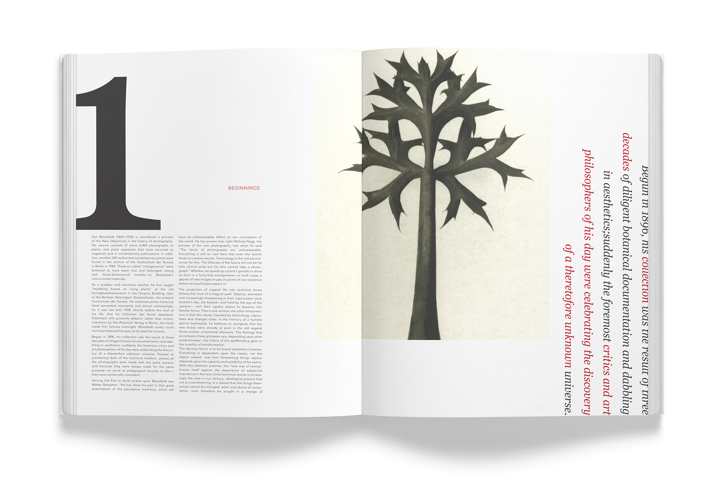
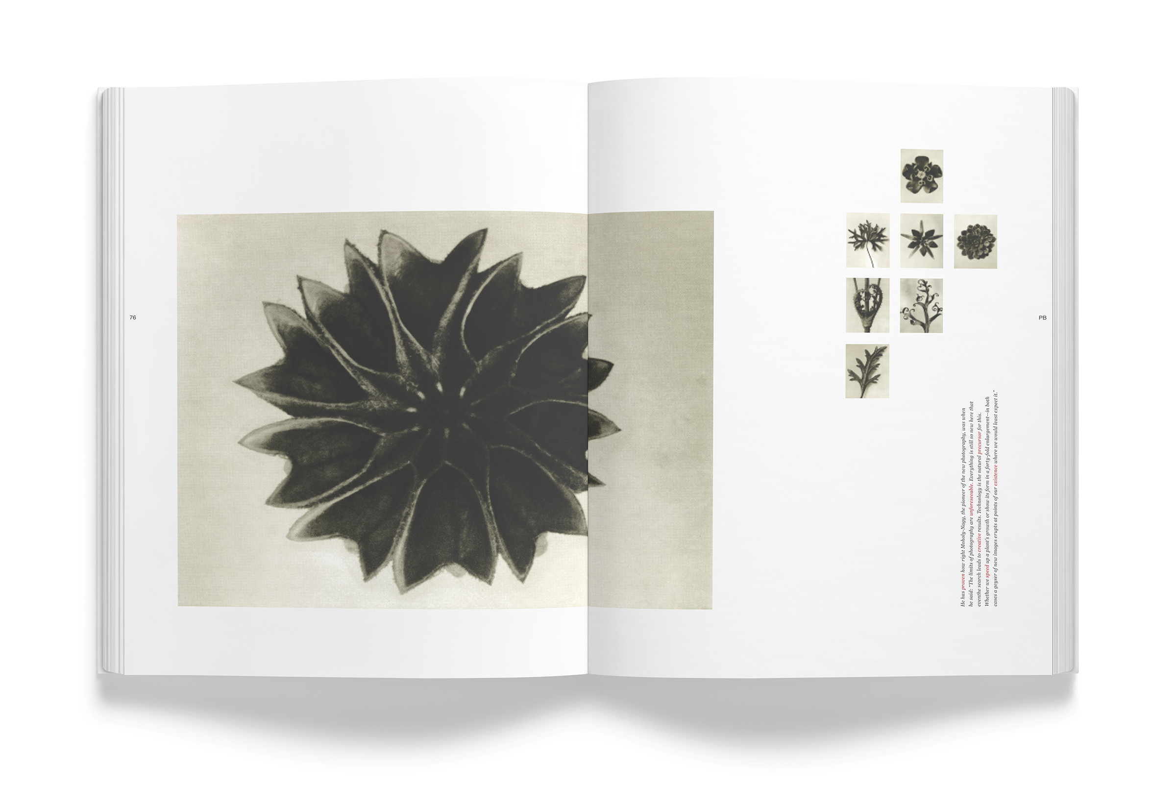
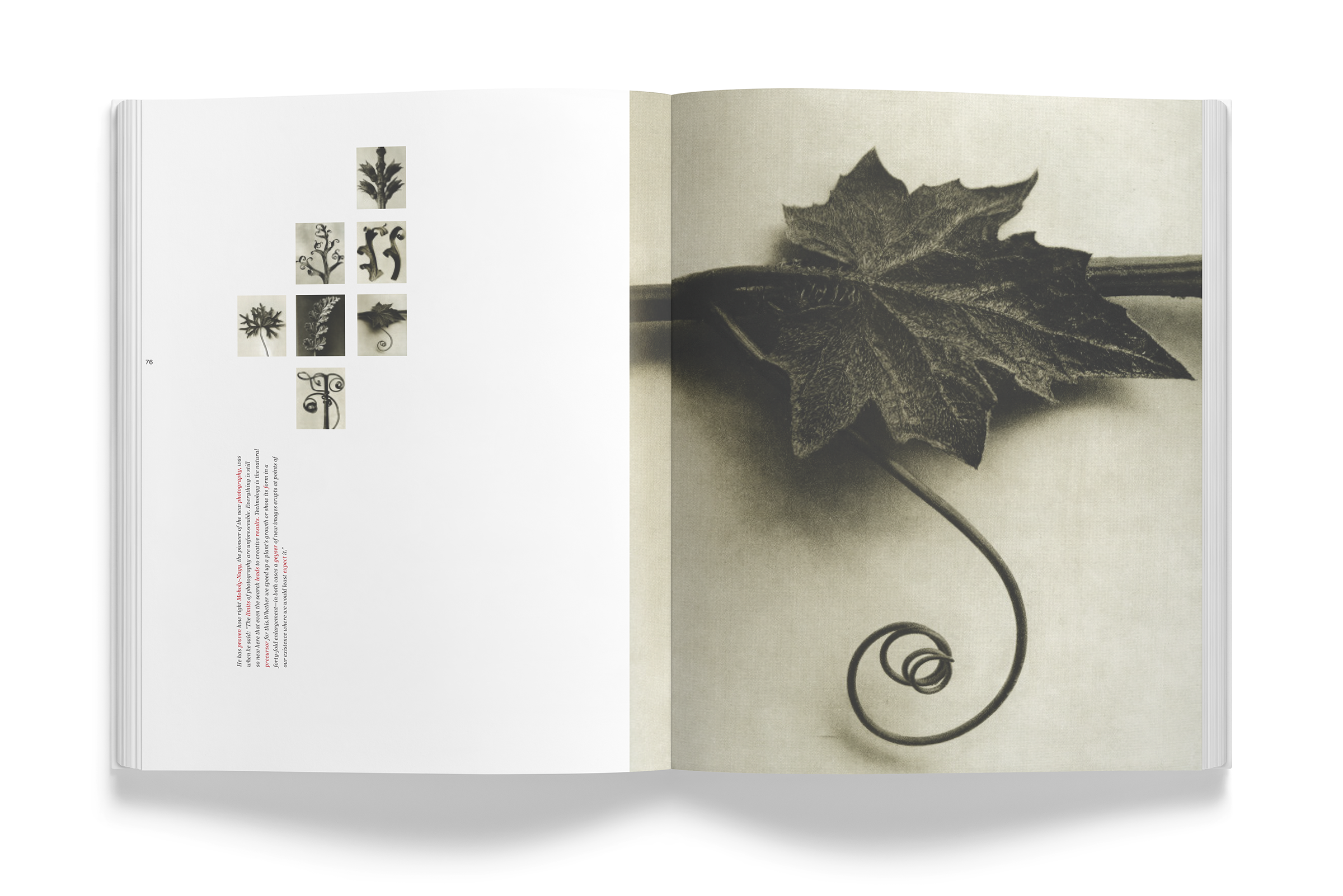
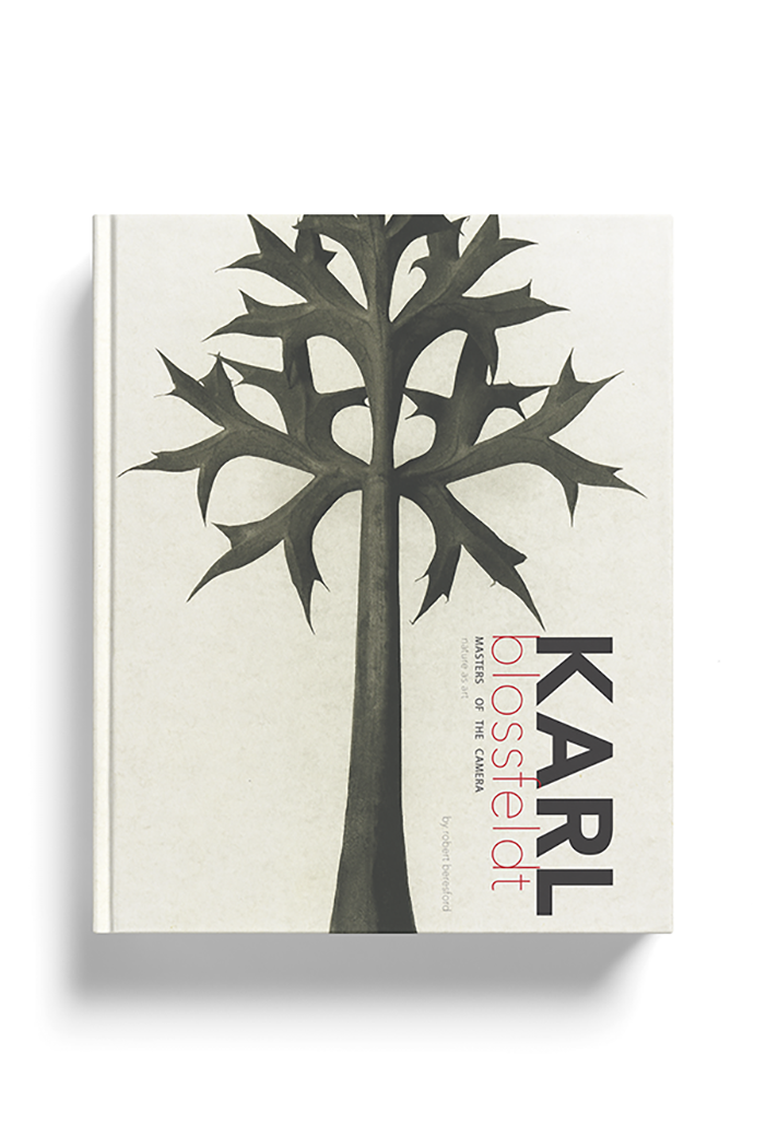
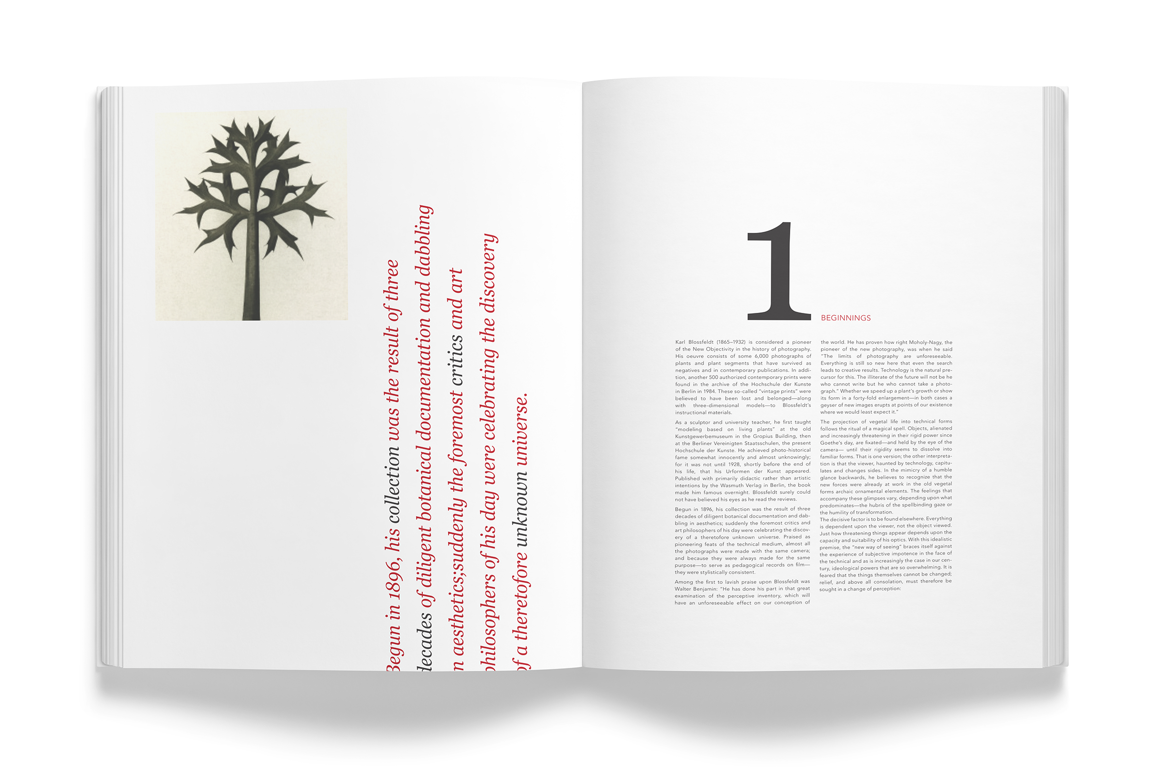
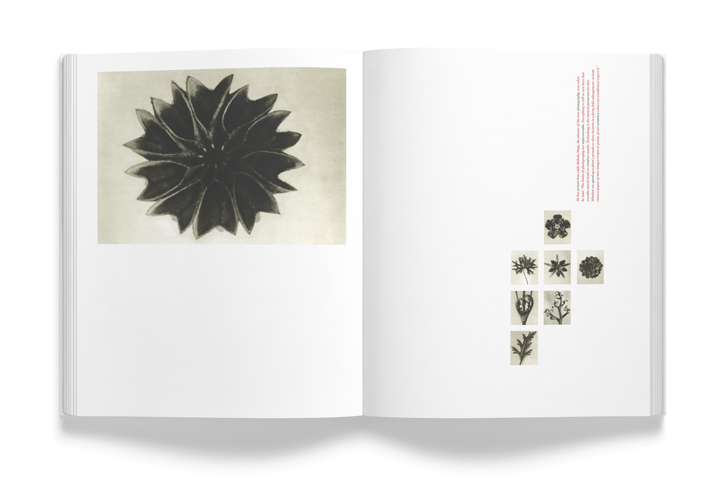
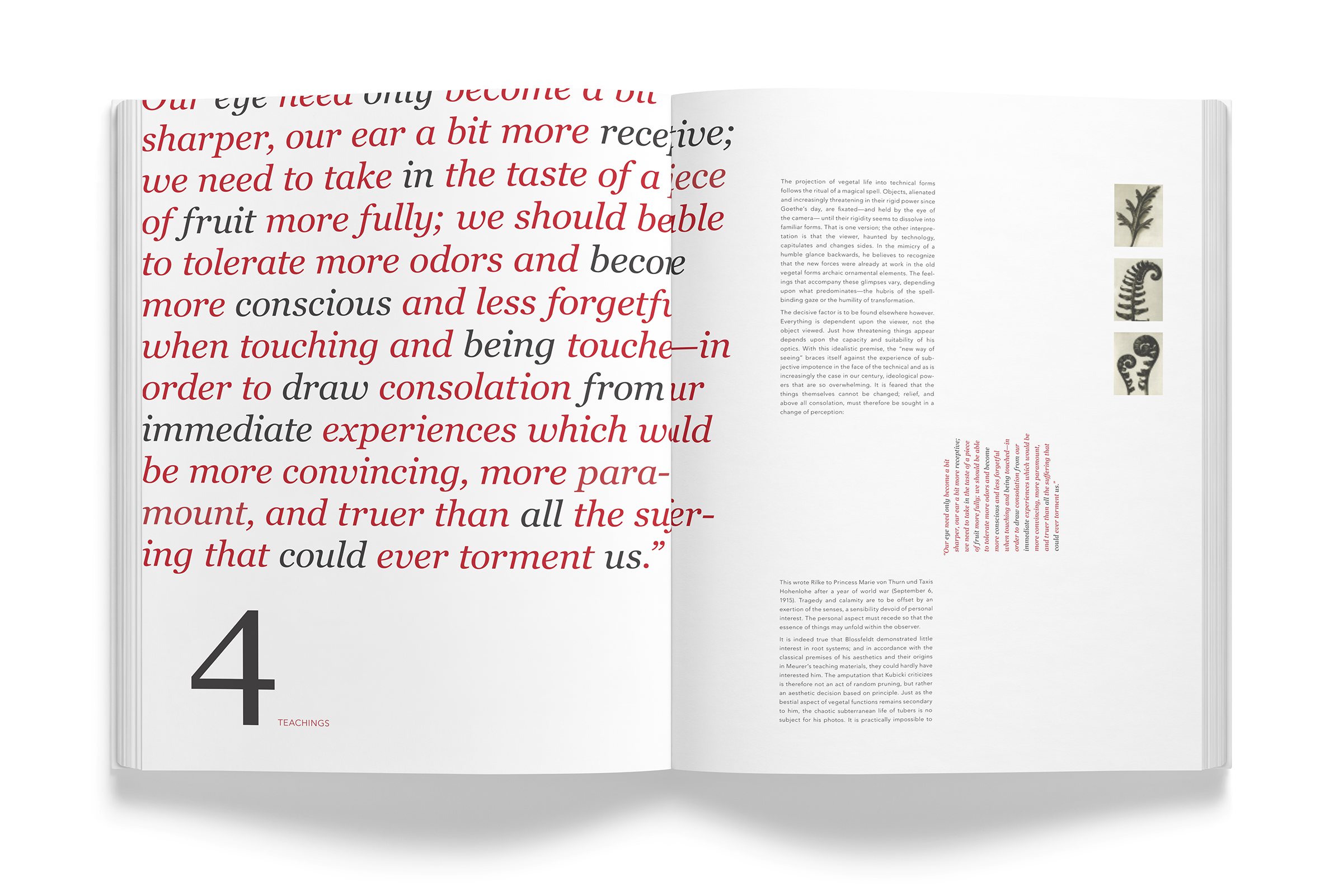
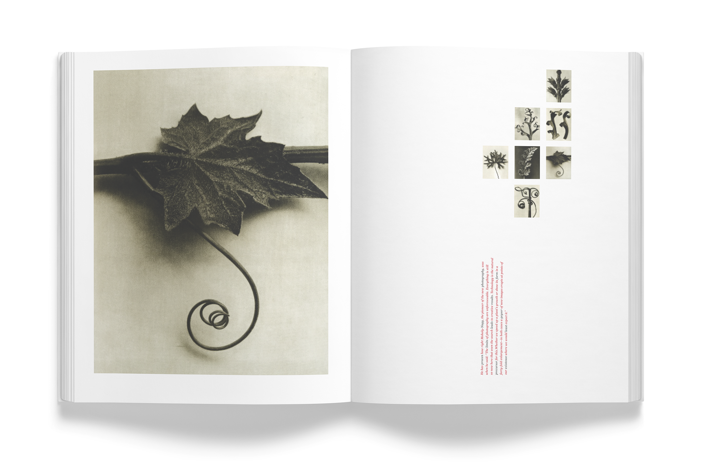
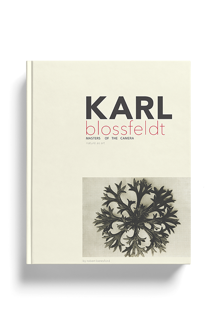
KARL BLOSSFELDT

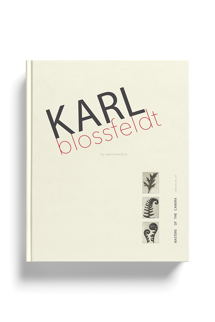


Project
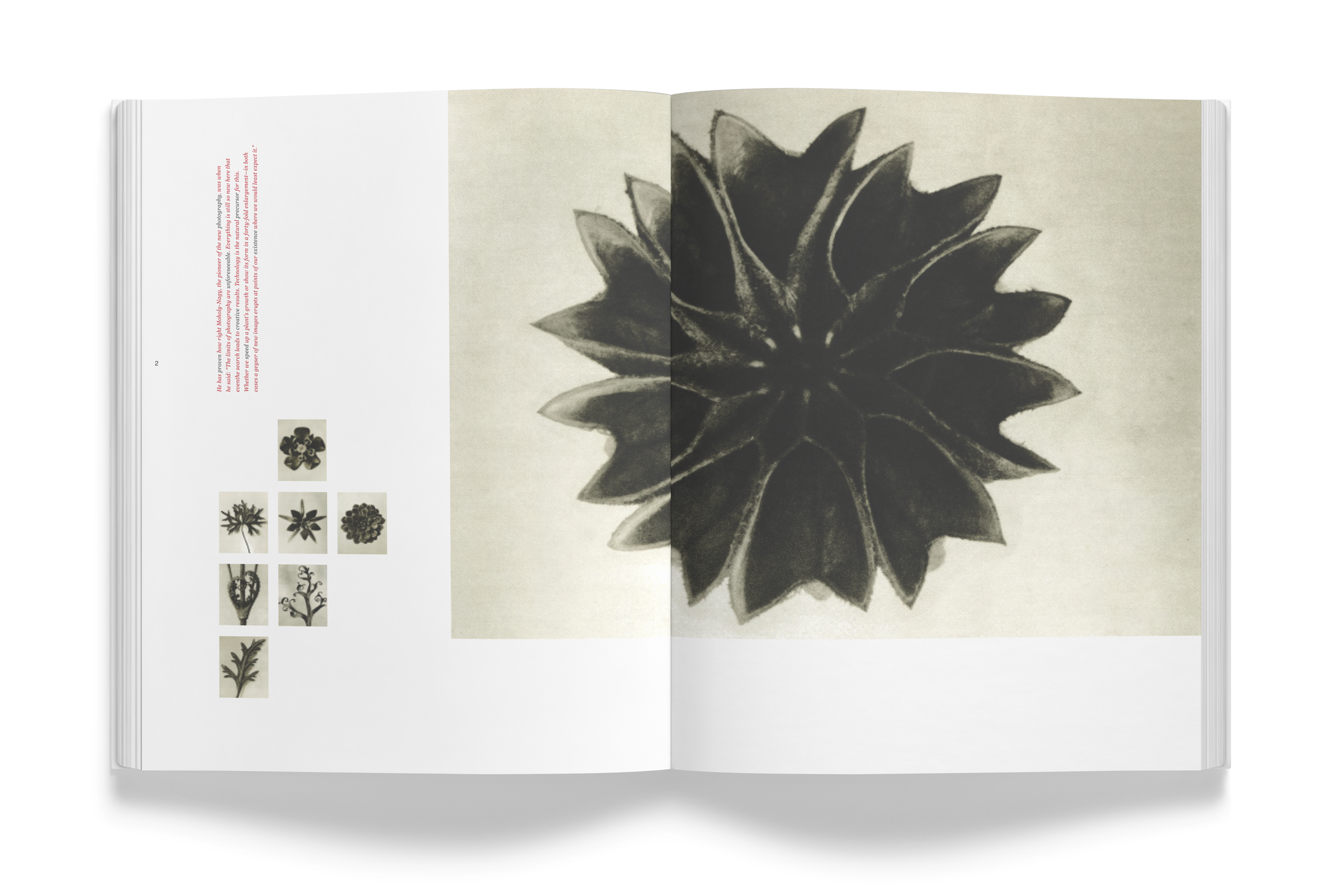
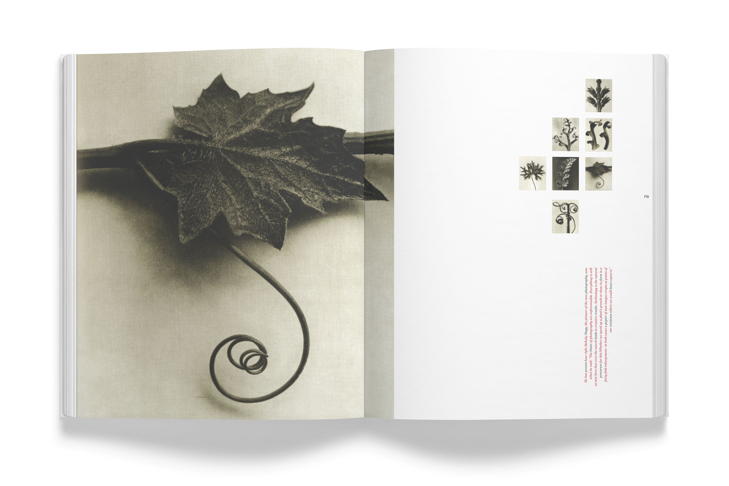
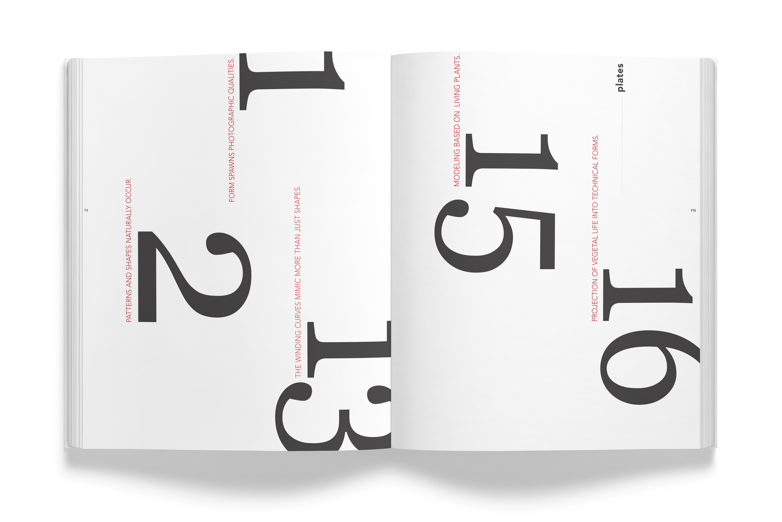
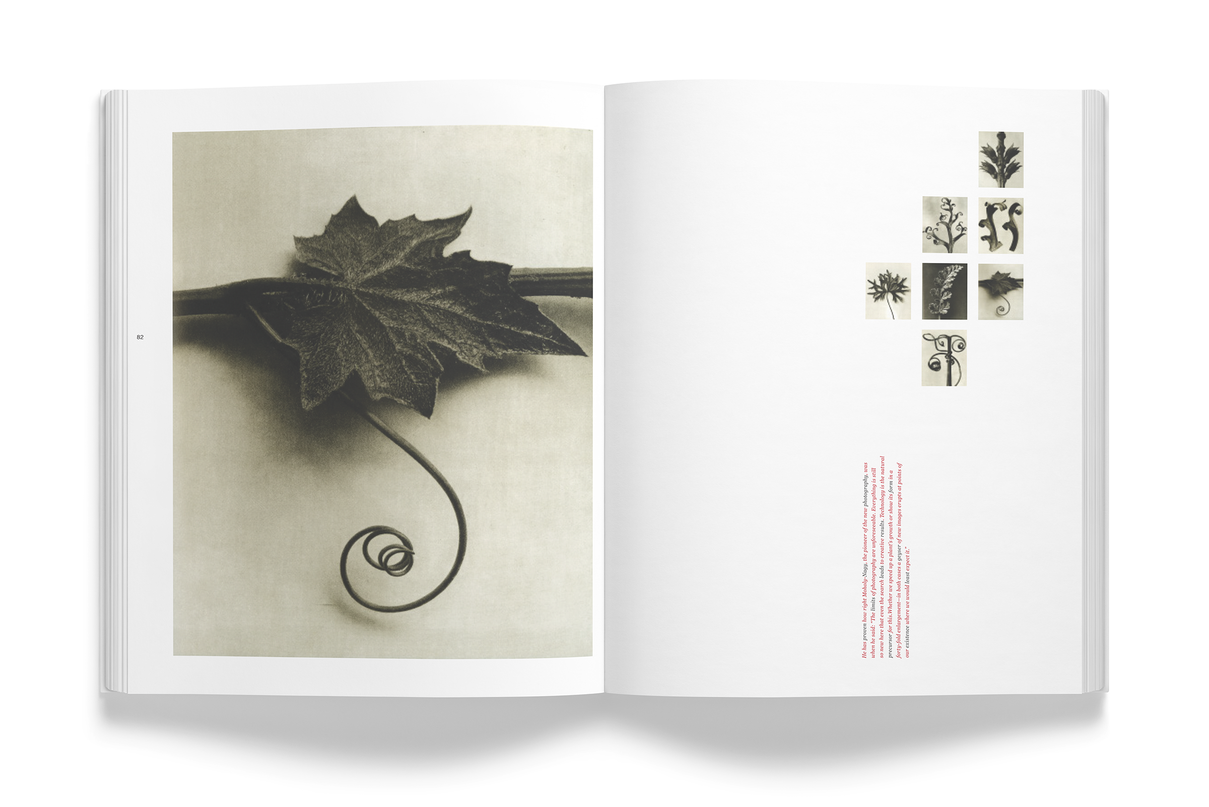
I was asked to design one photographic book five ways using creative typesetting, a vast scale contrast, and a select number of photographs.
the project required the use of black and white with one PMS color.
What I Did
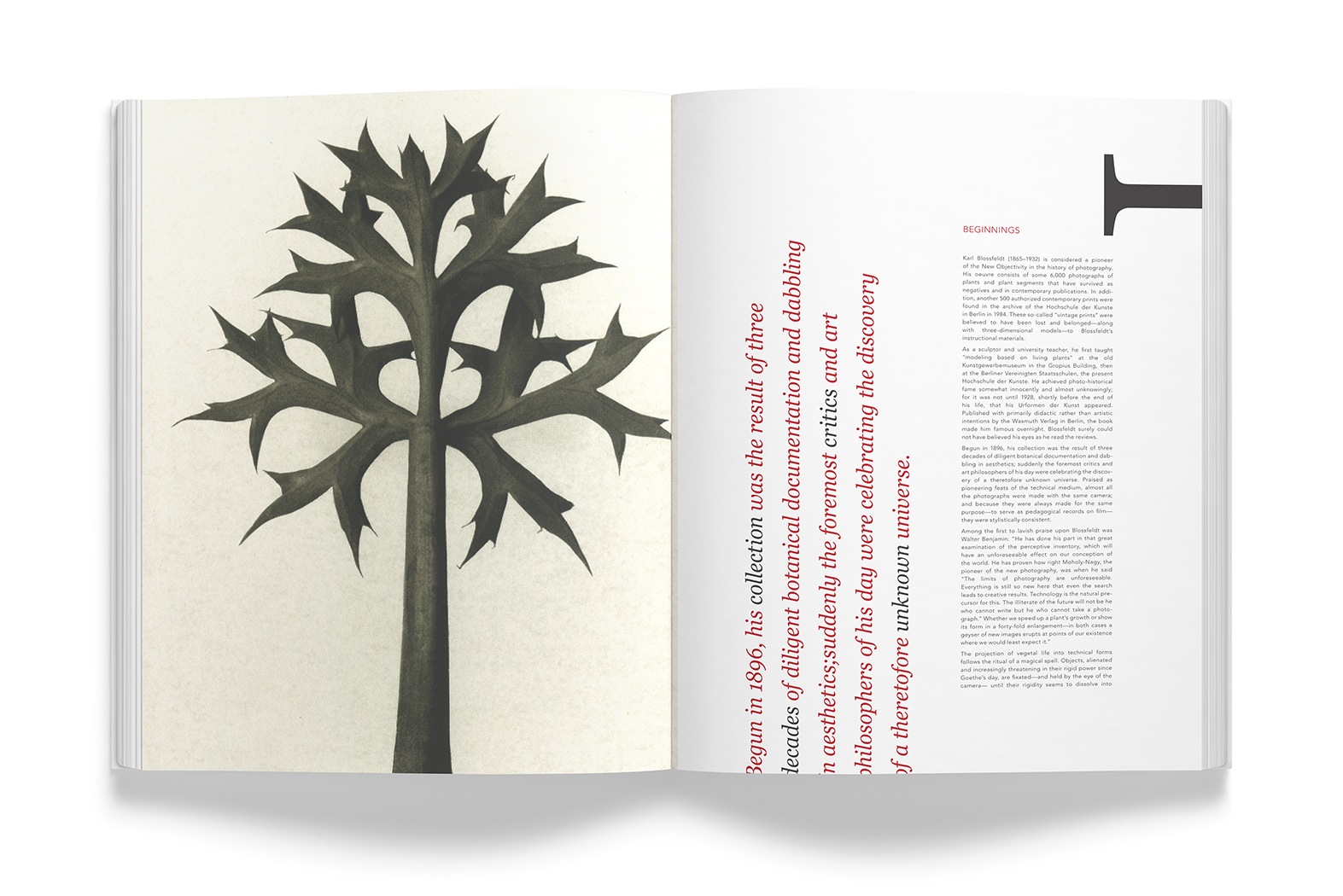
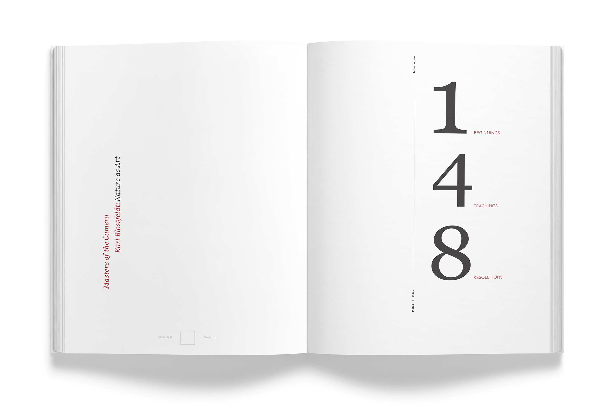
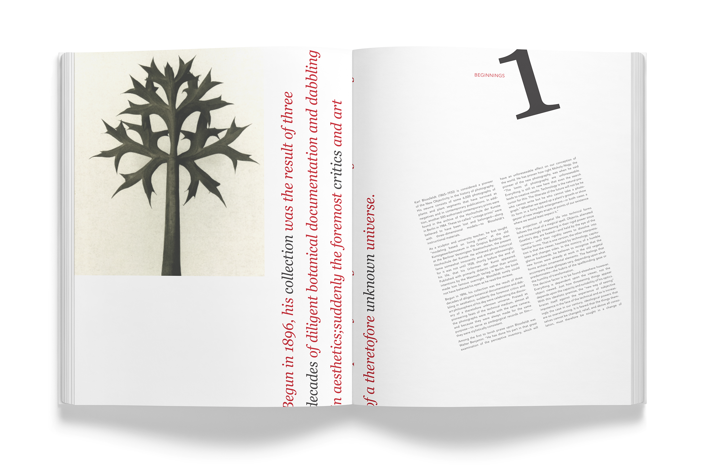
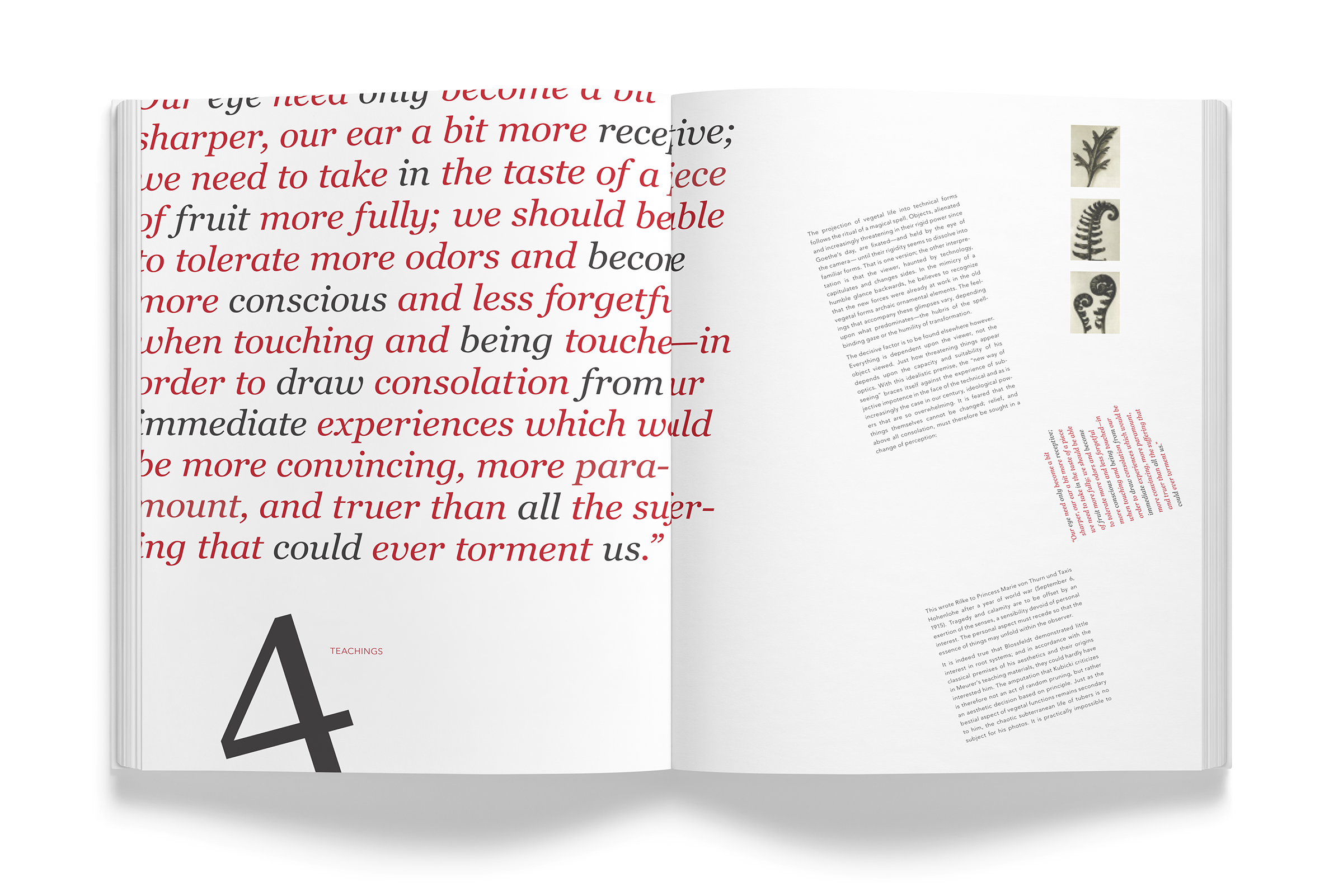
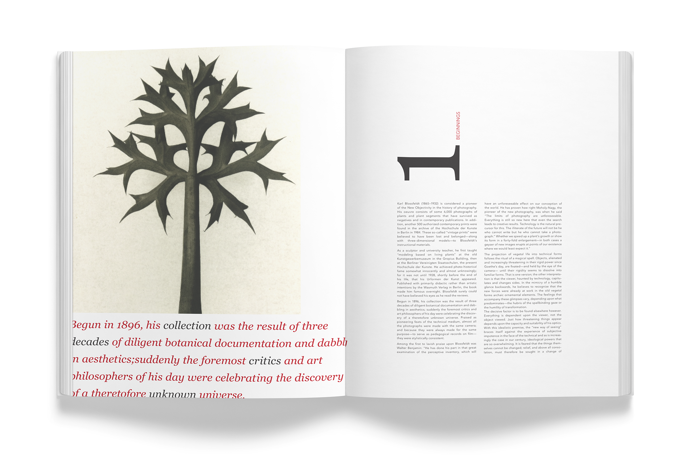
I approached this project using different grids; Modular, Compound, Double Column, and Multi-column.I then selected two contrasting but complimentary typefaces; Georgia italic and Avenir Light and set thebody copy creatively.
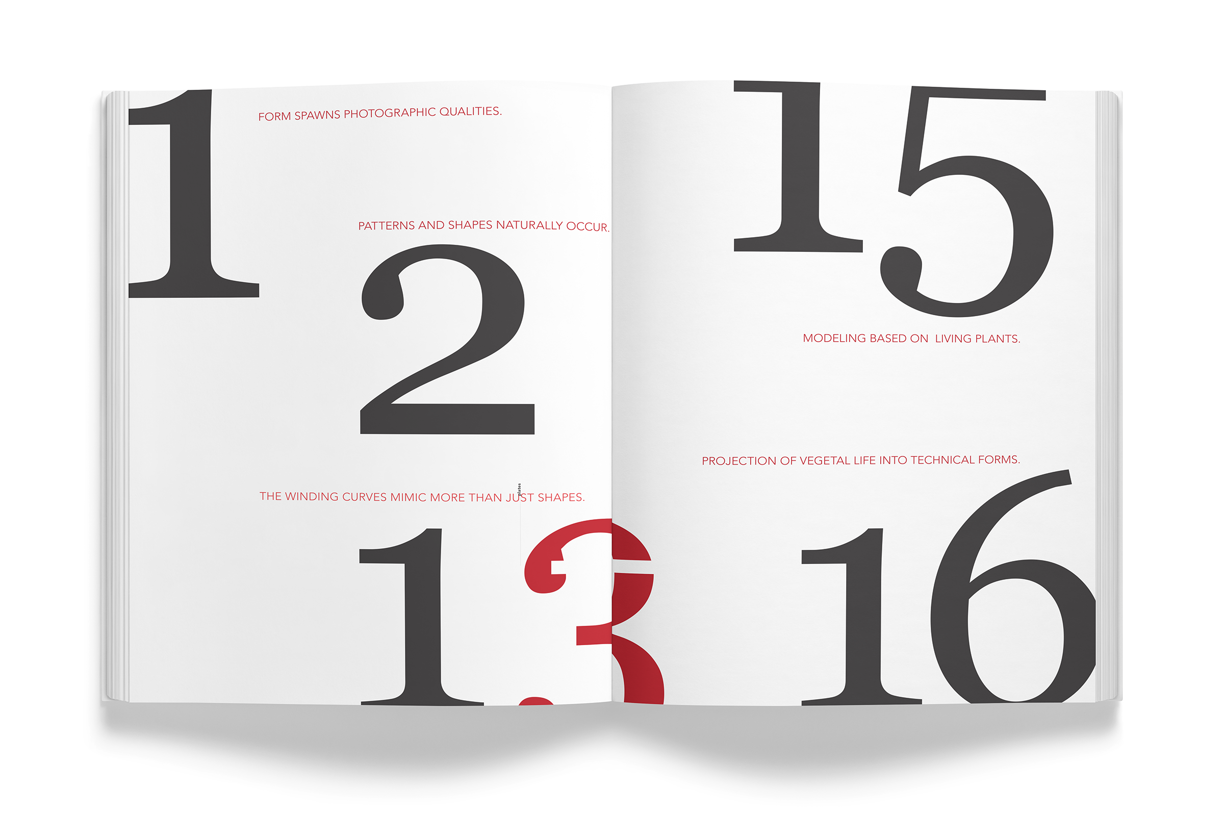
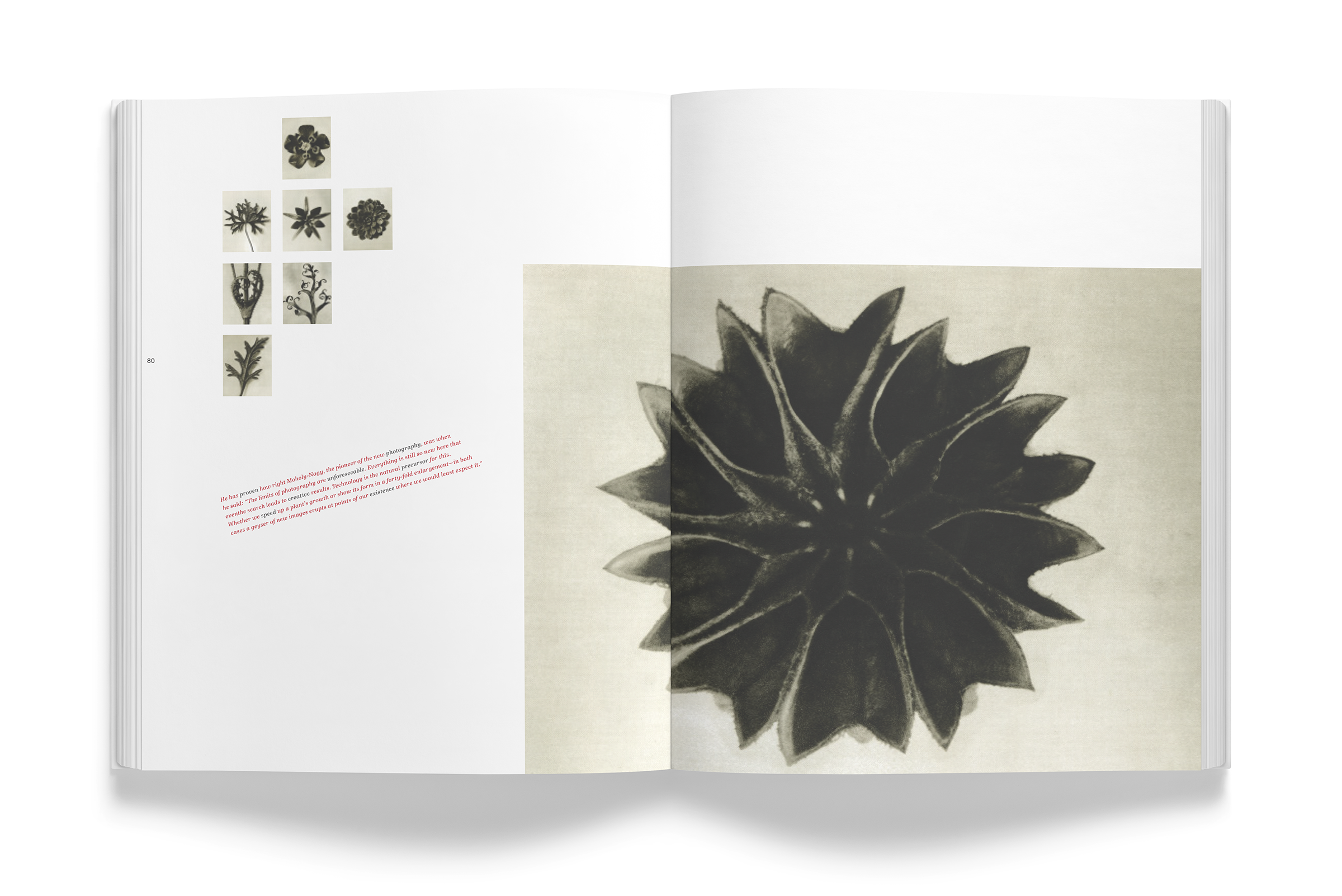
I varied the scale of both the type and the images to create high contrasts between the elements.
Design Choices
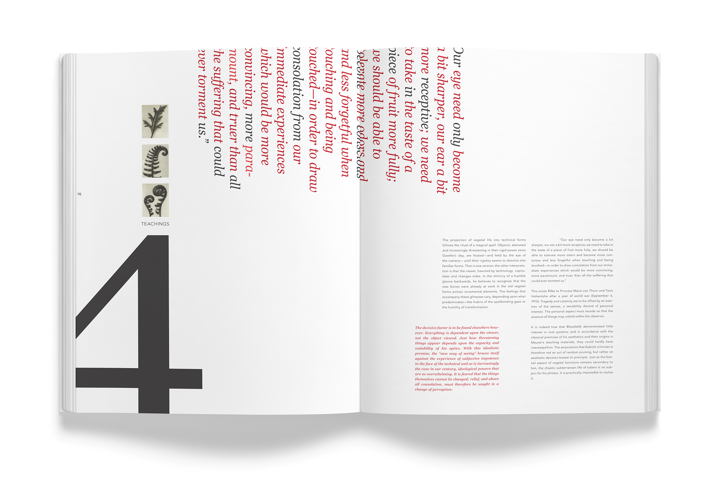
I chose black text and coupled it with a contrasting red. Typefaces I used worked well together and were set on and off the page as well as turned at different angles. I paced the spreads to include variations for visual interest. I bound the books as one large volume.